There is a larger issue artists of all stripes should spend more time contemplating. Loose and impressionistic, like tight and controlled handling of any art subject, involves numerous choices in the process, at the beginning and all along the way. In and of themselves, loose painting or tightly rendered detail are not artistic, regardless of what art snobs might say. Its how deftly you wield those styles that matter, right? Right! Sound a little obvious to you? Well it should, but its odd how little I see that aspect discussed. Loose painting is not more artistic simply because its loose. Its artistic because the loose passages were employed skillfully, maximizing the medium’s strengths and showcasing the beauty of color combinations, flow, center of interest, composition and a host of other elements that came together in a dynamic and pleasing way, albeit loose way. The same goes for tightly controlled, realistic rendering and detail. A piece is not strong because it is accurately rendered to the minutest detail. All the detail in the world, all the realism in the world can’t make a piece of art more artistic. Its the intangibles that matter: design, composition, light, value, leading eye elements or any of the other elements that also make a loose painting great.
If you follow my YouTube channel, you may have noticed that I’ve been uploading Strathmore Workshop videos over the last couple weeks. These were 4 videos done for their web site last spring (2016) and aired during each week of May. This year, as per agreement with Strathmore, the video rights revert back to me. So I thought I would also post all 4 workshop videos right here (as soon as each is uploaded) along with the downloadable photo reference I mentioned in the videos. Thanks for looking and post any questions you might have here or on in the YouTube comments section of each video.
We all want to improve as artists don’t we? Growing as an artist is the key to more enjoyment and satisfaction as we tread this adventurous but sometimes frustrating path. Practice is a given, but what happens when we get stuck and don’t know how to improve. The brave artist seeks appropriate, constructive input and critique. Its a tougher challenge, though, than we sometimes realize. Asking someone to tell us what is wrong with our art, which is so often a personal expression of ourselves, is also risky, baring our soul to the cold frigid winds of potential rejection. So if its done, it ought to be done right. There is good input and bad input. How do you tell the difference? Here are some pointers from my experience.
Veterans have served for a variety of reasons. For Americans, the reasons usually include the protection or our great nation, propagation of freedom and the dismantling of tyranny. While not all wars have been popular, the men and women who have served should all be revered for one simple reason – the decision to lay down their life, should they be called upon, for something greater than themselves. They did not serve a politician or a government but We the People, and an idea that this great Republic and what it stands for should continue for the good of all peoples.
Stop it alright! Just stop. The madness and the addiction has to end. Ok, no it doesn’t actually. Not completely anyway. I’m addicted too and as addictions go I could do a lot worse, but I wanted to sound semi serious for a split second.
What in the Sam Hill am I talking about?! Our beloved art supplies! We’re all obsessed aren’t we? Yeeesss, don’t deny it. I can see the 500 questions on the tip of your tongue right now. What brush is that? What brand? What size? What paint is that? What paper is that? Where can I buy it? What hand soap did you use before you started?
If you’ve frequented the fine art or painting section of your local book store, you’ve likely seen one of Mary Whyte’s Books. At least here in the Southern United States her books are a common sight. Watercolor Artist Mary Whyte may not be on the lips of every professional art connoisseur drawing breath, but something tells me that she will be spoken of more and more in years to come (If only by us “real folk.” Sorry art snobs. That probably doesn’t refer to you.) And in those years to come I wonder if we may one day speak of Mary as we now do wildly popular American artists like Andrew Wyeth. You know with that same reverential, wide eyed, understanding nod that makes us feel like we know at least a little something about art. “Oh yeah. that Andrew Wyeth, he’s the best.” But lets not trivialize her work. I have my reasons why I think the air around Mary’s work is rare. I may not be an expert on what makes notable artists notable in the years to come, but it won’t surprise me if Mary ends up as one of them. Who am I kidding, she’s probably half way there already.
If you saw the video in this post, my remarks beg a simple question – “Did I fail?” Well, for me the answer is yes and no. Many who commented on YouTube were gracious and said they thought the building sketch turned out great. And while I appreciate that, there is a deeper teaching moment here. If you’ve watched my other videos, you’ve heard me say it before. “Embrace failure as a teacher.”
The explosion in new, and sometimes awesomely cool, paper-crafting supplies got me to thinking recently.
Manufacturers have apparently responded to a huge rise in interest with a steady stream of “cool stuff” for the paper-crafting big three – card making, scrapbooking and journaling; including new markers, inks, dyes, powders, mists, etc., etc. Any self respecting fine art painter (an area, I might add, where new things don’t come a long nearly as often) would be crazy not to occasionally cast a sideways glance at the craft market and say, “hmm, wonder what I could do with that in my painting?” Multimedia artists (some of which are also journalers) especially would seem to benefit. But wait, not so fast… or maybe I should say, not so LIGHT fast.
Chasing the Fugitive
Scrapbook and journaling suppliers in particular seem to have responded well to the archival needs involved. Acid free papers, adhesives and mediums abound but there is still a big gulf where fugitive colors are concerned. Paper crafters have the luxury of not needing to worry about this much. Exhibiting art and prolonged light exposure is likely low on their “caution” priority list. But with so many new alluring dye-based mediums surfacing, any artist hoping to hang or exhibit work needs to be very careful of the mediums they incorporate. Dye-base mediums are the absolute worst in terms of fugitive colors. Pigmented mediums in the craft market exist but there aren’t nearly so many as you might think. Many illustrators fluent in using Copic or Prismacolor markers are not new to the concern over dye-based mediums, even experienced studio and gallery artists may tell you first hand, its no fun to see your precious artwork vanish before your very eyes after hanging on a well-lit wall for a few years.
Without doing a ton of research (for which I have no time), I thought maybe it better to just point you to some good reads where the work has already been done, by people who know where of they speak. Yeah, I’m just lazy that way. So, if your art will ever be displayed, read on and think carefully (think pigmented and archival) before you go including that cool new set of watercolor markers, powders or sprays in your next painting.
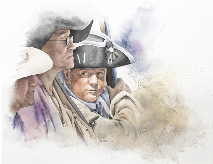
One of my favorite re-enactment events in the Upstate, SC area is Festifall at Walnut Grove Plantation. To see more of this event I have a post with pictures here.
Many of the photos I take at these events eventually become reference for paintings. Here is one of my latest watercolor paintings entitled “The Muster” using reference from the Walnut Grove event. Enjoy.
A recent watercolor I did. This reflects several elements I wanted to play around with. First of all, I love to illustrate historical subjects and historical figures. My reference was a black and white photo taken of Roosevelt and Churchill at a summit meeting near the end of World War II. In this case I wasn’t fussy about likenesses. I focused more on technique and style. I wanted to reinterpret the scene in color but with a very limited pallet. I really love this approach and will definitely do more work from a limited pallet.
Watercolor Board
This was also my first time using Arches watercolor board. I’ve always been a fan of their watercolor paper but I absolutely loved this board. It’s essentially board-mounted Arches hot press watercolor paper. Some watercolor boards I’ve used have been worthless in that workability was a problem after a bit of scrubbing, lifting or heavy washing rendered parts of the surface practically useless. I haven’t fully tested the limits of the board yet and it will probably not have the working durability of say 300lb. paper but nevertheless I am duly impressed. It will most likely be a staple for me in the future.